GIS
Go from geocoded data to a map using Geographic Information Systems (GIS).
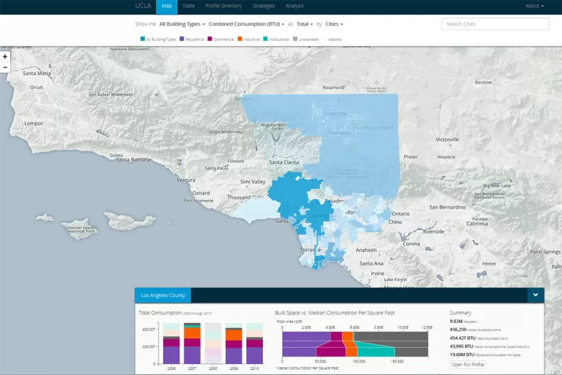
Maps are a compelling and effective way to communicate spatial information.
They can range from relatively straightforward static visualizations included in a publication to interactive web-based presentations. In research, maps convey data that have a relationship to location, for example population by place or digitized objects contextualized by their location of origin.
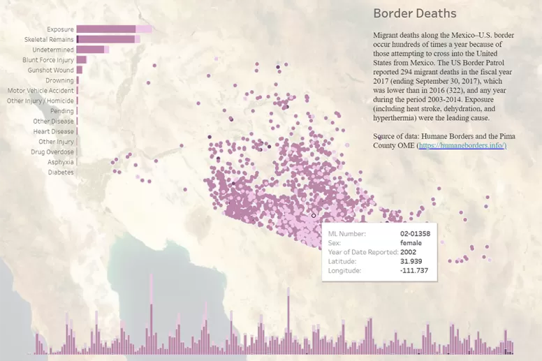
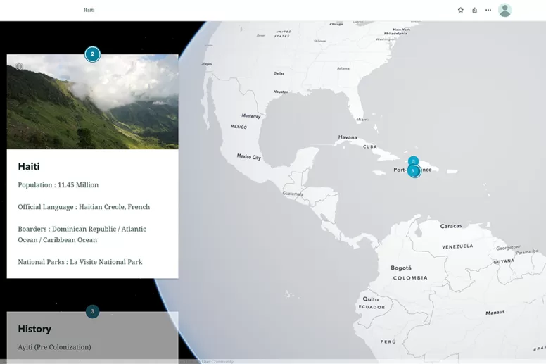
Maps that allow you to zoom, pan, or embed information, including images.
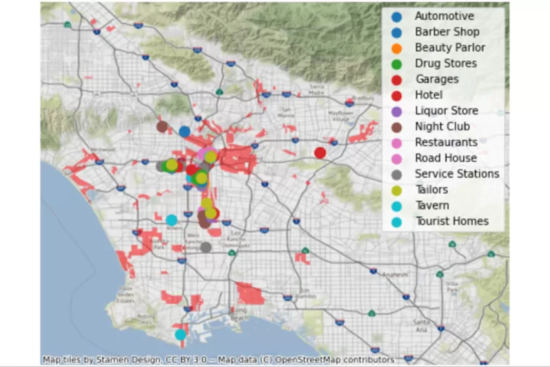
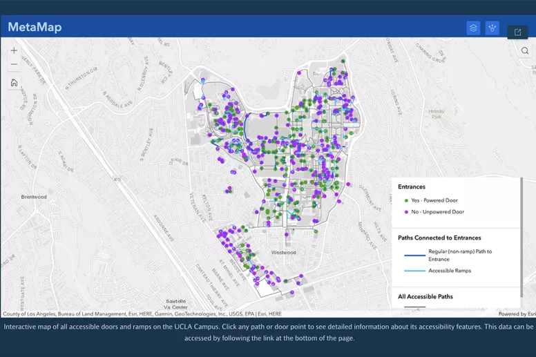
Develop maps that are accessible to those with disabilities.